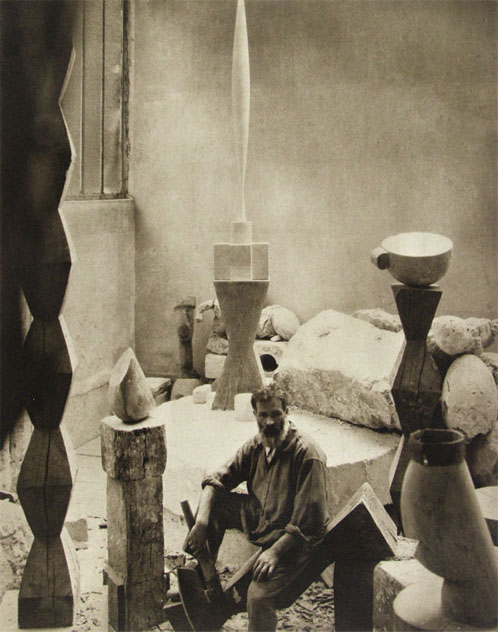
 I am always looking for that overlap between the art world, the real world, the design world, and my world. Although brancussi is not a direct influence on me and my work i am aware enough of the history of art and contemporary sculpture to understand his influence and where it overlaps my production and work. I also see the re-emergence of his influence on contemporary design. I have pondered before the fact that art has begun to look more like design and design more like art. I think this trend might be the result of the re-evaluation of both disciplines undergoing scrutiny from within the ranks. I have seen an over abundace of imagery in the design world making use of the artist hand or rougher marks, and have seen fine artists move away from the presence of the artist mark moving towards a pseudo professionalism and high design aesthetic. I think for the artworld this is a reaction against the faux naive tendencies that swept the artworld a few years back. In the design world i think it is an absorption of the the faux naives work, which is a good thing. Design could stand to soften the edges. as the regular world gets over designed designers will experience the same disgust with slickness that artists have started to feel. For brancusi's part he stands as a good marker of design meeting art meets the early artist studio blog.
embodied in his art were readily absorbed into the fabric of contemporary home design and products that his work no longer looks like art but rather like home goods, computer mouses, trash cans , light fixtures and anything else for me i know brancsusi more as the subject of an iconic photograph of the artist in his studio, than as the maker of a work of art. his art has always been easy to miss in museums , since it is usually cordoned off by ropes and can't compete with buildings it is housed in. the principalsmichael graves has designed for target.
new thought
although i doubt handwriting and the handwritten word will lose their immediacy as a graphic element, i have noticed that scrawl and handwriting have emerged as design elements. I guess this is the ultimate custom font. this reminds me, i am still working on making a font based on my handwriting since time and again i have been told i have "unique" handwriting(unique is code for sloppy and illegible). But back to why bracusi matters to my practice. every time i feel the tendency to set up my tripod and set the timer on my camera to document myself at work in the studio, it is not just an act of narcissism but is a connection to bracusi's legacy and the artist who creates and tracks his development within his own private world.
this is a sequence of photos showing what i did with an old railing i found on the side of the road recently
 first i cut off the supports

then i cut the square stock steel into smaller bits

then i made a rough drawing of what i wanted the "basket " to look like. I think making the break from strictly process work to image based work provides a balance for me and helps me complete the circle between my drawings prints and works on paper and my sculpture and installations

For brancusi, the image of birds in flight gave inspiration to much of his output, and lately i have seen the bird image re-occur in contemporary design and packaging. i always ponder why this is and i think it might be part of a larger movement back towards nature derived imagery and away from design or purely computer based imagery for designers.


No comments:
Post a Comment