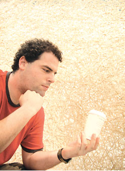
in this picture i am holding another one of starbucks new toys, which i want everyone to get and send me more of, it is a special plastic stir stick that also plugs the drink hole in the sippy lid. It is really weird because it has a stylized mermaid as the top most element of it. I also worked on some logo re-designs of my own and when i get them cleaned up and ready i will load them up here
 the day before starbucks released their re-designs i had already painted these plaster coffee cups based on the color scheme of the old cup. So i immediately began work on a new cycle of coffee cup inspired pieces and drawings based on the new logo.
 A week ago i found and hauled back to the studio all of the old furniture from a subway that was being remodeled.
I took one of the single benches and threw it on top of an old crate in order to create my very own eating seating in the studio
 I then proceeded to disassemble the two double seats to see what I could do with them
 the first permutation of the double seat endless loop was held together with the hardware salvaged off of the seats.
but it turns out that the hardware was not strong enough, and much to my delight i came the next day to discover a new variable sculpture arrangement involving the collapse of the seats which crashed into the picture frames.

 needless to say after i re-installed the frames and played around the subway seats as room dividers I moved on to execute my original vision for the seat parts.
here is an image from afar of the seat parts held together with a set of double re-enforced hardware seems to be working.


No comments:
Post a Comment